
Holista, co.
Overview.
In this case study, I have created a comprehensive visual identity for my wellness coaching company (you heard that right). The scope included developing a unique brand identity, designing a logo, crafting UX copy, designing a responsive webpage, and producing engaging YouTube thumbnails. The goal was to establish a cohesive and impactful brand presence that resonates with the target audience and reflects the core values of healing, stress relief, and professional growth.
-
My role.
As the sole Visual UI Designer, I was responsible for managing the entire design process, from concept to execution. This included defining the vision and goals for the project, designing the visual identity, and ensuring a cohesive and engaging user experience across all platforms. I independently handled the creation of the UX copy and produced key assets, including the website layout and YouTube thumbnails, while maintaining consistency and alignment with the overall brand identity.
-
Timeline.
One week- Ack! The project had a tight deadline, which required focused effort to meet the goal. Despite the heavy workload, I prioritized tasks efficiently to ensure timely completion without sacrificing quality. I successfully delivered the project on time through consistent effort and careful planning.
-
Tools.
For this project, I used a range of UX/UI design tools including Adobe for creating detailed visuals, Canva for quick design elements, and Squarespace for building and customizing the website. I also leveraged WixBusiness for additional site management and ChatGPT for brainstorming and content creation, ensuring a smooth and efficient design process.
Target Audience.
The primary audience for this wellness coaching company includes women professionals who experience stress and are seeking healing. These individuals are looking to improve their mental and emotional well-being while managing the pressures of their careers and personal lives. The design needed to appeal to this group by conveying trust, calm, and empowerment, helping them feel supported in their wellness journey.
Key Problem.
The main challenge of this project was to create an entire brand identity from scratch and deliver all key assets within just one week. This included not only the visual elements like logo design and web layout but also creating the voice of the brand through UX copy and ensuring all materials were consistent across different platforms. The tight deadline required rapid ideation and efficient iterations to meet client expectations without compromising quality.
Visual Design
The UI design process focuses on crafting the visual and interactive elements of a digital product to ensure clarity, consistency, and aesthetic appeal. It starts with defining a visual language—color schemes, typography, iconography, and layout grids—that aligns with the brand and enhances usability. Attention to detail, accessibility, and responsiveness are key, as the goal is to guide users seamlessly through their journey while making the interface visually appealing and easy to navigate.
Color Palette
#F8F3EF
#E2690D
#B8A750
#E3AA52
#92AAC3
Typography

Reasoning
I chose an energetic summer palette to create a sense of inspiration, joy, and momentum. While earth tones are common in wellness and coaching spaces, this brighter palette helps the brand feel fresh, uplifting, and stand out from the crowd — without losing warmth or approachability.
For typography, I went with a classic cohesive sans-serif to create confidence for users. Its clean lines bring a sense of professionalism and structure, while still allowing room for personality. It’s clean and grounded, while subtle touches of bricolage introduce a bit of playfulness — keeping the design both professional and fun.
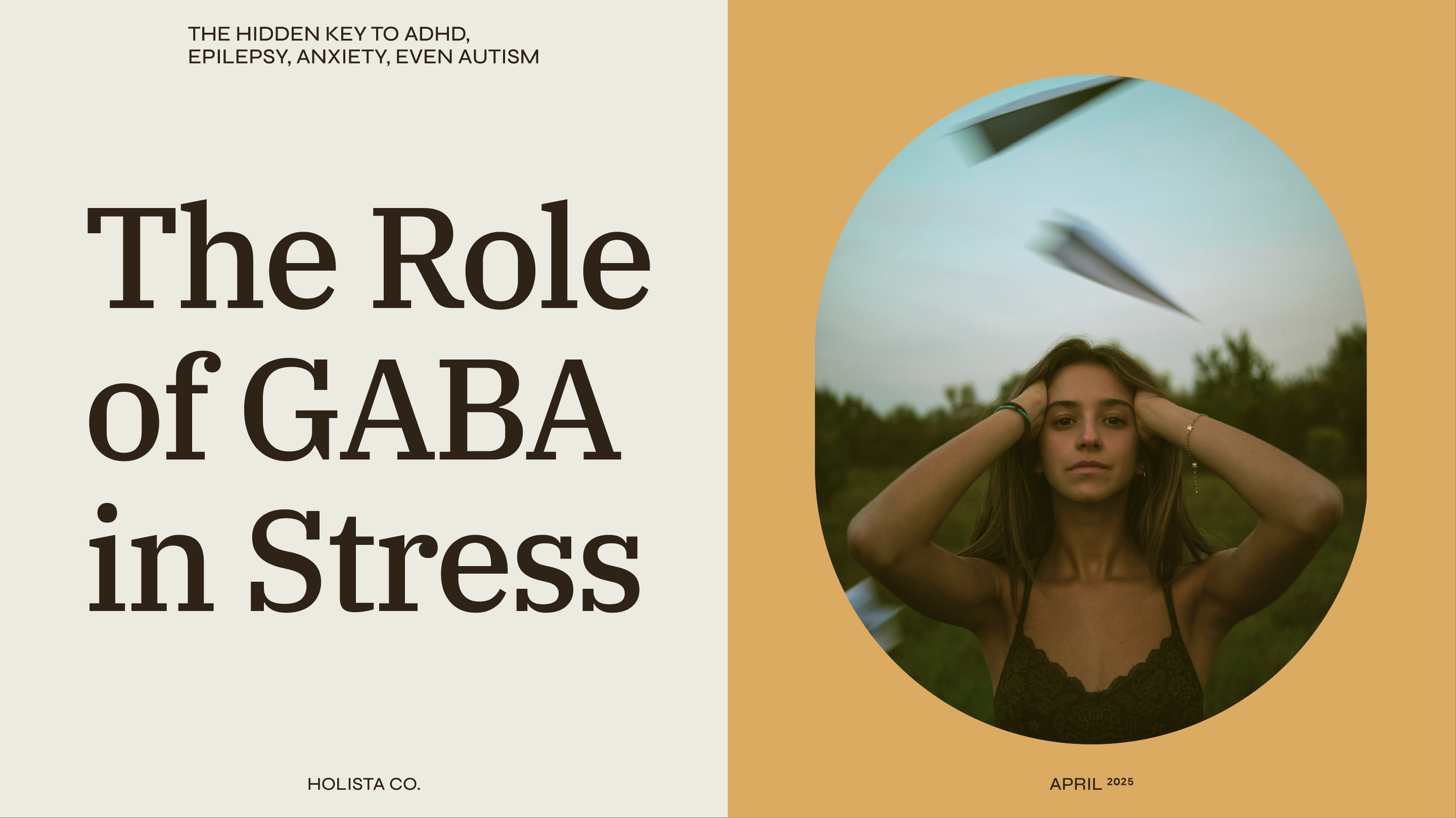
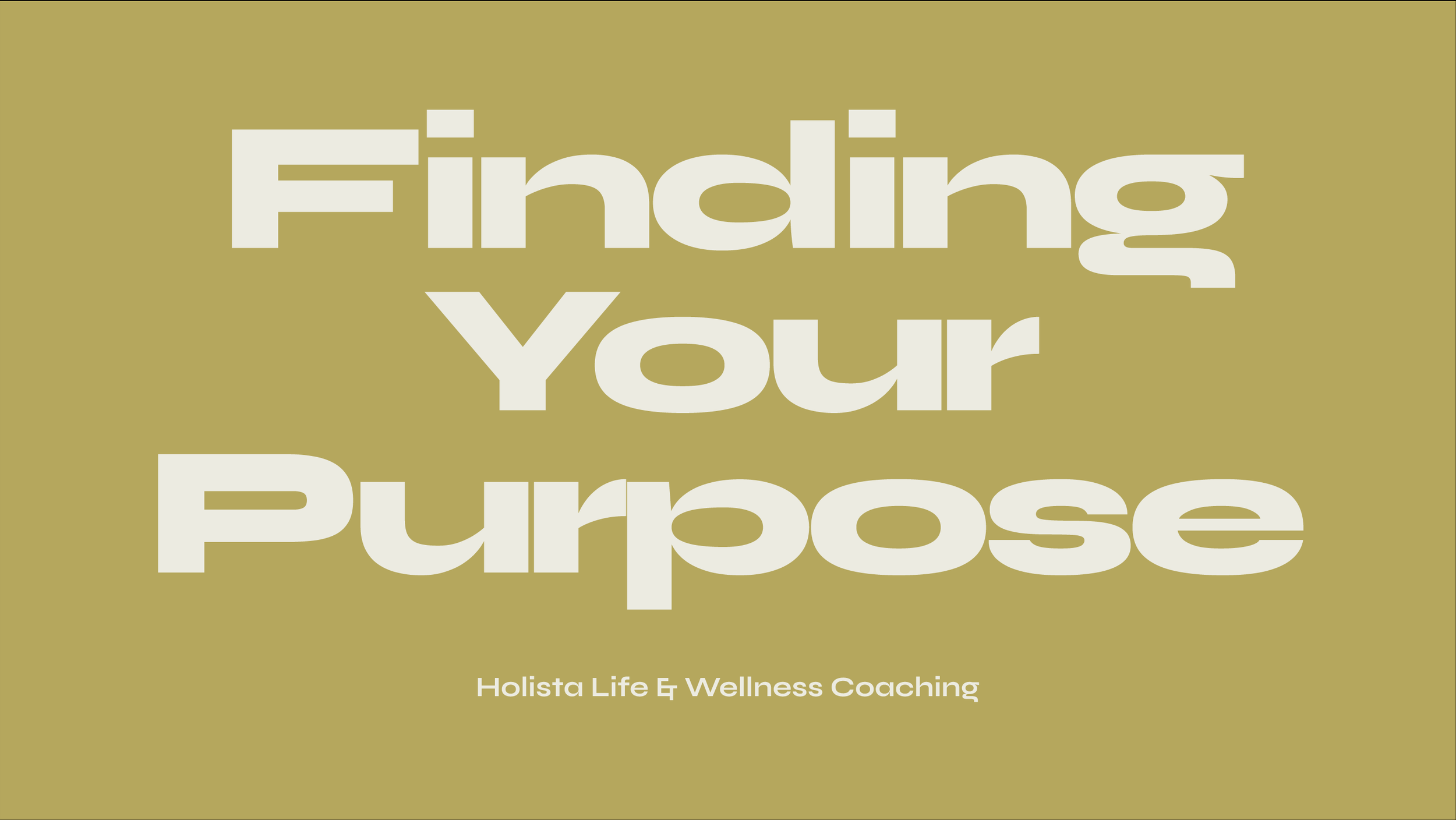
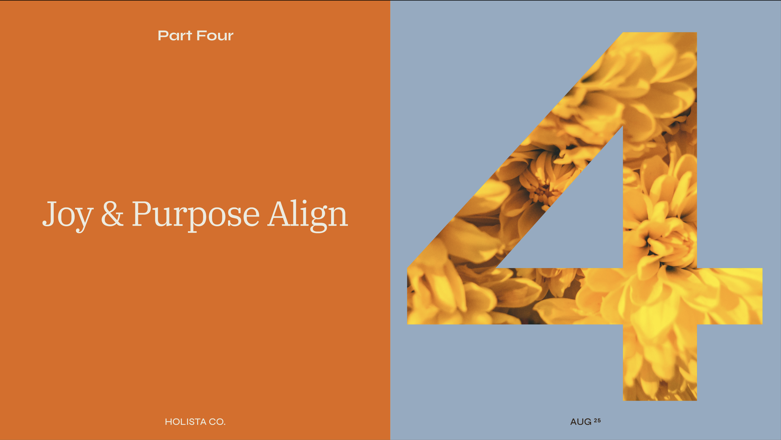
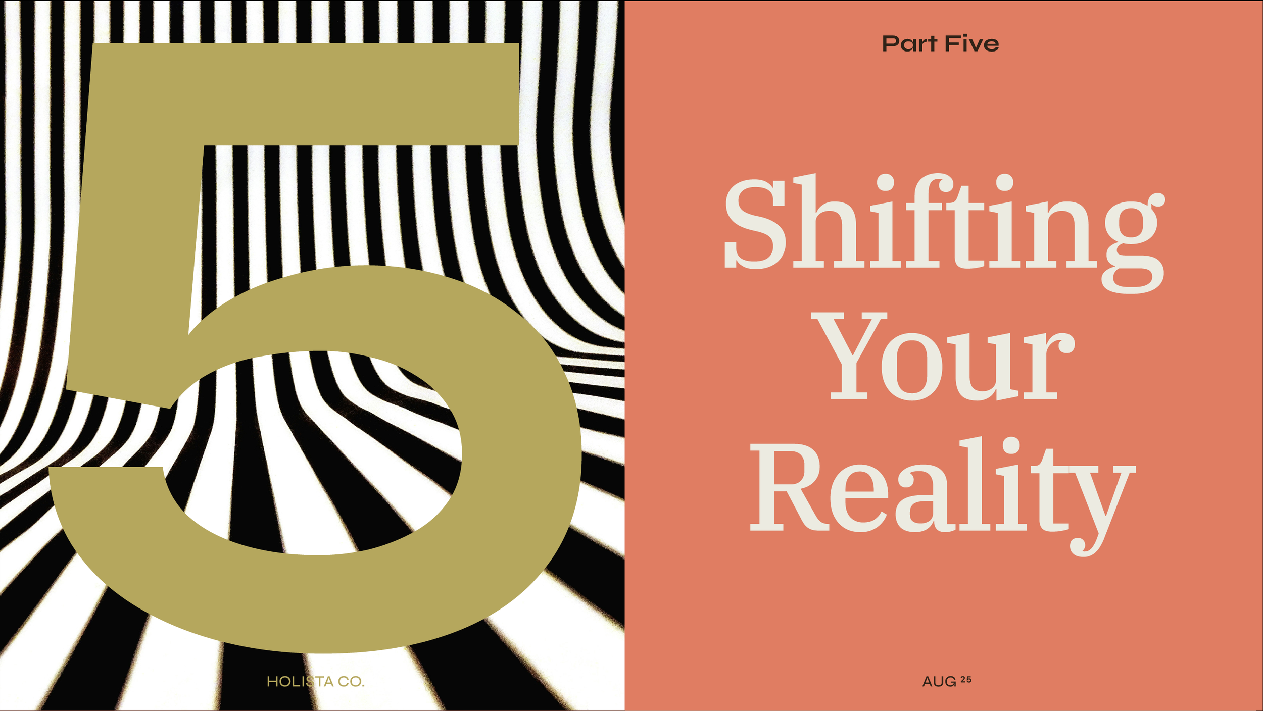
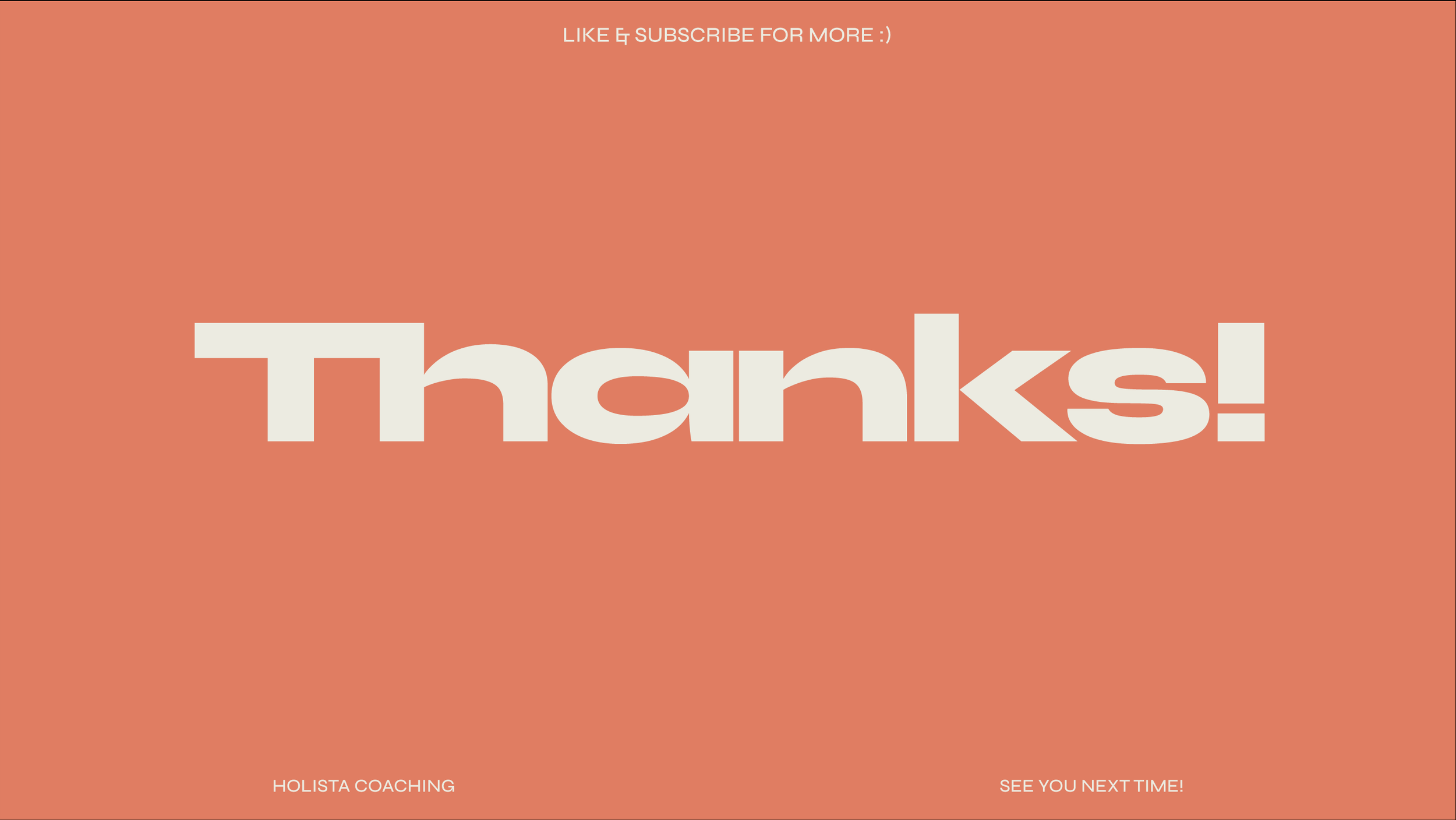
Thumbnails
Designing YouTube thumbnails for a UX design project involves balancing visual appeal with clarity to effectively communicate the video’s content at a glance. A strong thumbnail uses bold typography, high-contrast colors, and clean composition to grab attention while aligning with the overall branding of the channel. In a UX context, thumbnail design becomes a user-centered task—aimed at improving click-through rates by understanding the viewer's needs, behaviors, and expectations.


The Prototype.
Final Thoughts.
Whew! That was a lot to tackle in a short amount of time. Personally, I’m proud of the achievements made within the tight deadline. Moving forward, I’d love to conduct UX research to gather valuable feedback from users and dedicate more time to refining the page architecture. The current design was rapidly created, driven by intuition, existing knowledge, and creative expression.