Overview.
In the summer of 2024, I crossed paths with a passionate PNW Scuba Diver who saw an untapped opportunity in his market. He envisioned a dynamic, interactive map that would give divers quick access to detailed specs and user reviews. I partnered with him to turn this idea into a user-centric tool that would transform the diving experience.
Throughout the process, we encountered a few challenges, including a limited budget, an evolving brand identity, and the hurdles of adapting to a brand new ux design tool. Let’s dive in and see how we tackled these obstacles!
-
My role.
As the sole UX/UI Developer on this project, I led the full design and prototyping process from discovery through implementation. Beyond user research and wireframing, I was responsible for building the site’s core experience using Framer, a no-code design tool that allowed for high-fidelity interactions without the need for a dedicated engineer. I also managed communication, client education, and all UX deliverables—balancing strategy with hands-on design execution.
-
Timeline.
The project spanned four months, kicking off in June 2024 with discovery, research, and brand exploration. The timeline was tight and the scope dynamic, which required an agile mindset as we adapted to shifting client needs and new technical constraints. Despite these challenges, I stayed focused on delivering a solution that was intuitive, scalable, and aligned with real-world user behavior.
-
Tools.
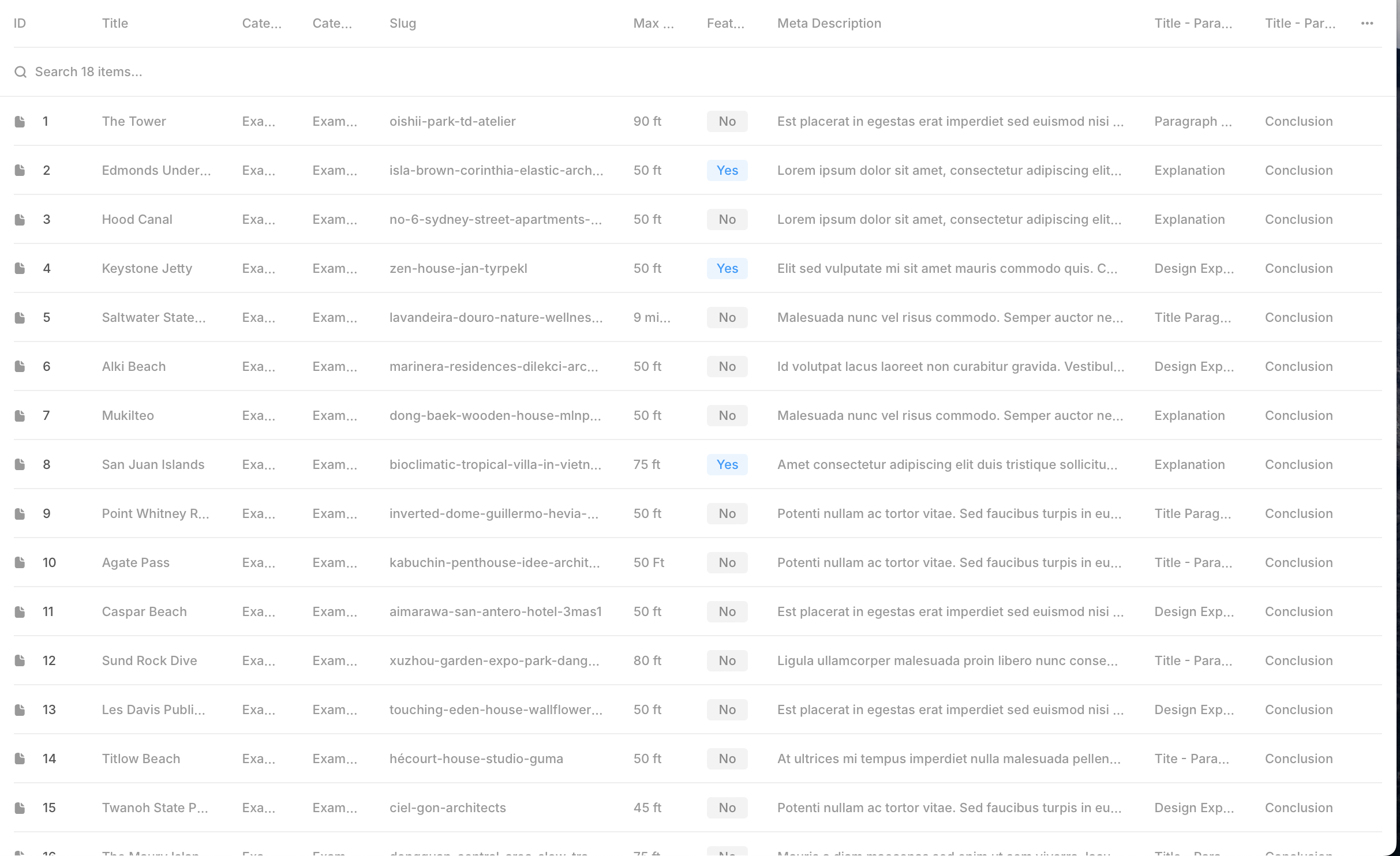
To bring the DiveSearcher platform to life, I leveraged a combination of Framer for no-code prototyping, Figma for design system organization, and Mapbox to integrate a fully interactive dive site map. I also used tools like OptimalSort for information architecture testing, and implemented a content management system to automate user-submitted reviews and site data. These tools helped ensure that the final product was not only visually engaging but also grounded in usability and long-term maintainability.
User Research
To better understand the needs and behaviors of our target users, I conducted a mix of qualitative and quantitative research. This included user surveys, live interviews with divers of varying experience levels, and active engagement in scuba diving forums and Facebook groups. These insights helped surface key pain points—such as fragmented dive information, outdated resources, and a lack of community-driven tools—this directly informed the design strategy and feature prioritization for DiveSearcher.
Foundational Design
Before moving into visual design, I focused on building a strong foundation through information architecture and site mapping. This involved organizing key content types, defining user flows, and structuring navigation to support intuitive exploration of the platform. By prioritizing ease of use from the start, I helped ensure the design would scale effectively while meeting user needs for efficiency and discoverability.

Double Diamond Strategy
Before we begin designing solutions for the program, we need to be able to isolate and define the core problem(s) that we want to focus on.
Most new products don’t create brand new markets; rather, they improve on existing ones.
Learn more about this approach from Britain’s Design Counsel.
Current Market Issues.
Found during user research, client intake, and market analysis ...
Scarce or non-existent scuba site locators
Participants often prefer to find dive information in books thus needing to do a lot of prior research to properly plan
Users have come across several pain points in other scuba forums or websites from old and outdated information
One research participant even brought up PNWDiving and said they were ‘overly technical and too complicated’
Divers often find their information by word of mouth and/or friends
Disorganized and random information throughout the web, forums & books, etc.
Solving Each One.
This is key if we want to develop a product that genuinely works and sells ...
Simplify this process as much as possible for users, specifically through organized website architecture
Create buttons to invite or connect with friends via social media
Consider a ‘plan your dive’ feature with a thorough filtered search
Make sure the visual design is bright, fun, and intuitive for users
Create an archive database of dive sites so users can get wherever they’d like, as quickly as possible
Personal input, SEO marketing, and user reviews should keep all information up-to-date and relevant
Problem Statement
Our users need an organized, intuitive, and enjoyable scuba site locator for Washington because most of the information on the market is convoluted or sporadic. We will know we have accomplished this goal when 400 user accounts have signed up for the program.

Program Map
Information Architecture (IA) is the practice of organizing content so users can navigate and understand it intuitively. The concept has roots in system design—IBM used “architecture” in 1964 to describe the structure of data systems. In 1976, Richard Saul Wurman coined the term "Information Architect," applying architectural principles to information design. Like a building, a digital experience needs a strong foundation—without it, even the most visually appealing interface can fall apart in usability.
Branding
The UI design process focuses on crafting the visual and interactive elements of a digital product to ensure clarity, consistency, and aesthetic appeal. It starts with defining a visual language—color schemes, typography, iconography, and imagry—that aligns with the brand and enhances usability. Attention to detail, accessibility, and responsiveness are key, as the goal is to guide users seamlessly through their journey while making the interface visually appealing and easy to navigate.
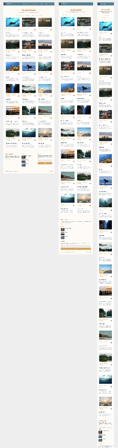
Mid- Fidelity Frames
Given the project’s condensed timeline, I made a strategic decision to skip low-fidelity wireframes and move directly into mid-fidelity designs. Each frame was thoughtfully crafted to balance speed with precision—carefully addressing layout, functionality, and user flow. This approach allowed us to make meaningful design progress while respecting both the client’s time and limited resources.


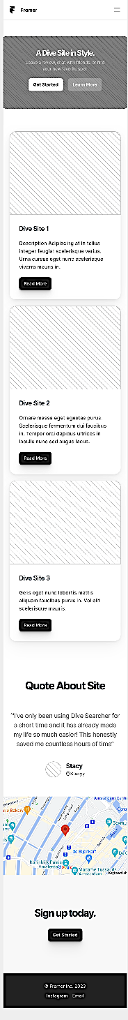


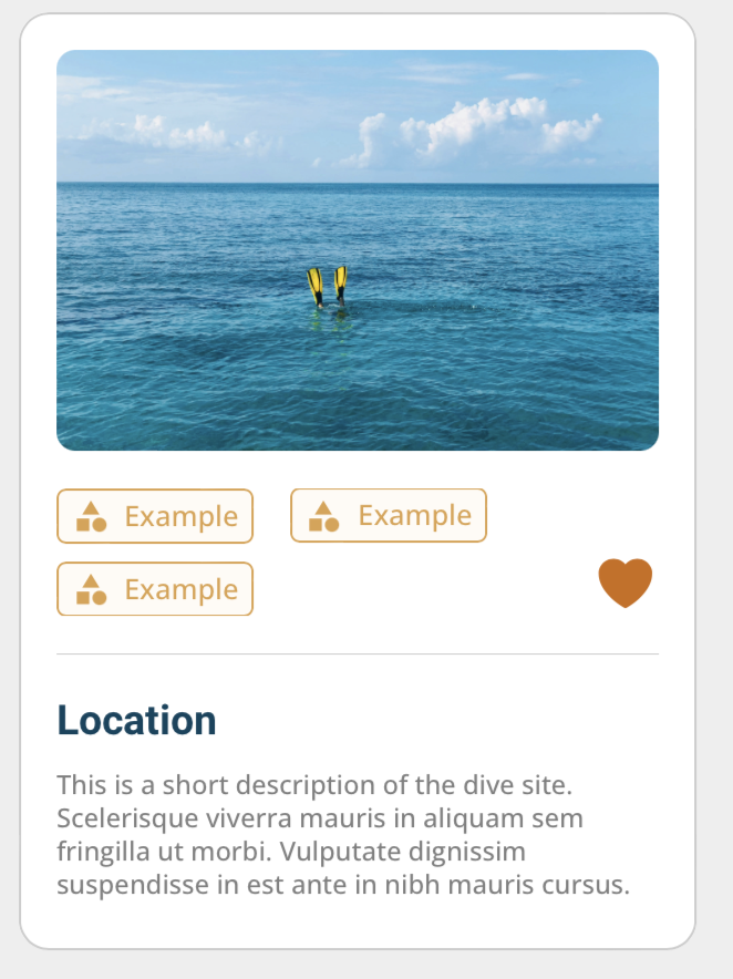
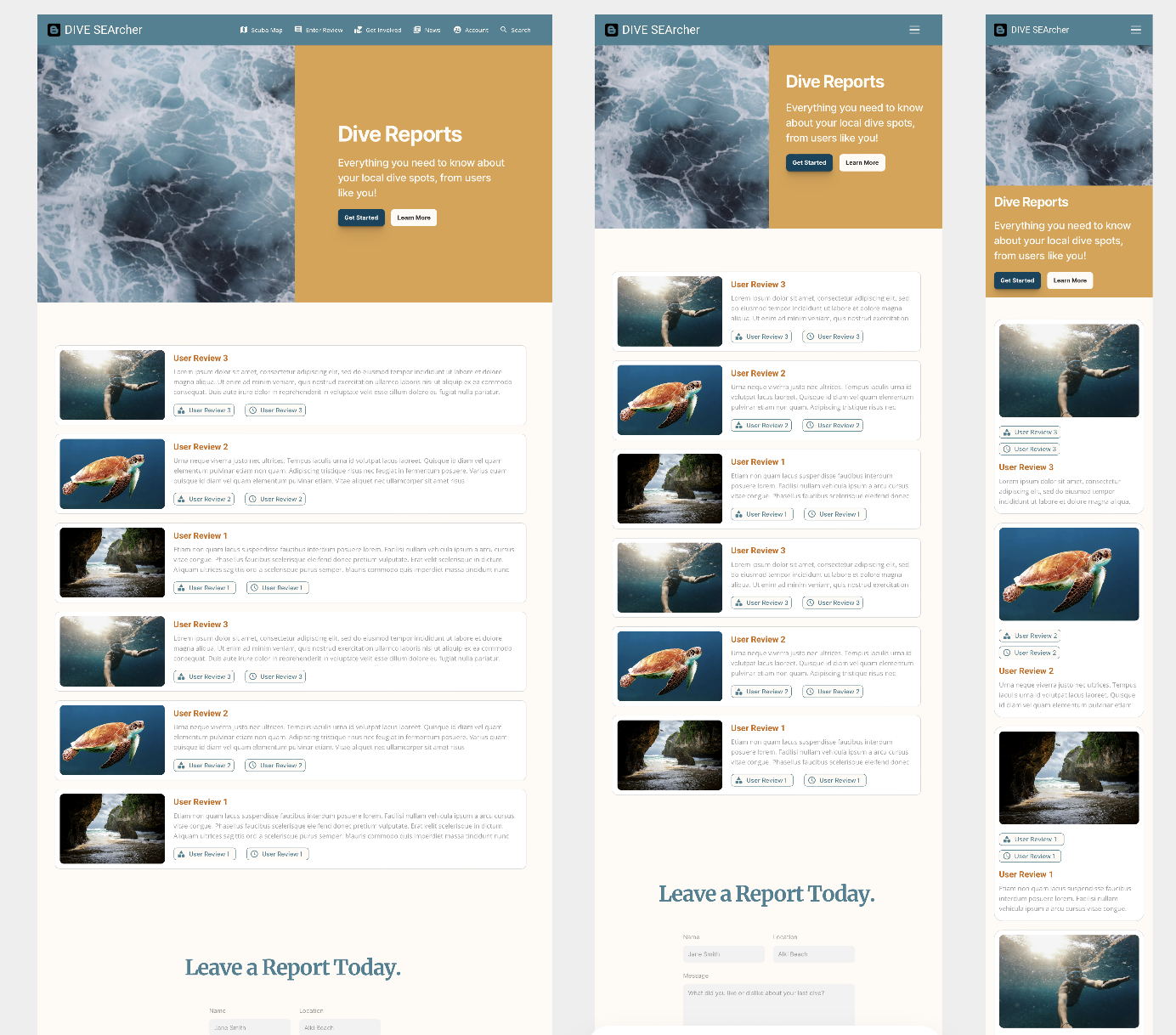
Hi- Fidelity Frames
Version One
Building on the structure established in the mid-fidelity stage, the high-fidelity frames brought the DiveSearcher experience to life with full visual styling, brand colors, and interactive components. These designs closely reflected the final user experience, incorporating refined UI elements, iconography, and responsive layouts. The hi-fi prototypes allowed for more detailed user feedback and gave the client a clear sense of how the product would look and function in a real-world setting.


The Prototype.
Reflections & Learnings.
DiveSearcher challenged me to take on a multifaceted role—UX/UI designer, developer, and project manager—all while guiding a first-time founder through the design process on a limited budget and timeline. It was also my first time working with Framer, which presented a steep learning curve. While I initially dove in headfirst, I’ve since learned the value of pausing to build foundational skills early—it would have saved time and minimized rework.
Although the project ultimately wrapped before full completion due to funding constraints, we were able to bring the product to roughly 85% completion, with a solid foundation for future buildout. The experience taught me how to work lean, adapt quickly, and guide clients through ambiguous territory. From shifting feature priorities to multiple branding revisions, I strengthened my ability to balance creative vision with realistic execution—an essential skill for any designer working in real-world product environments.